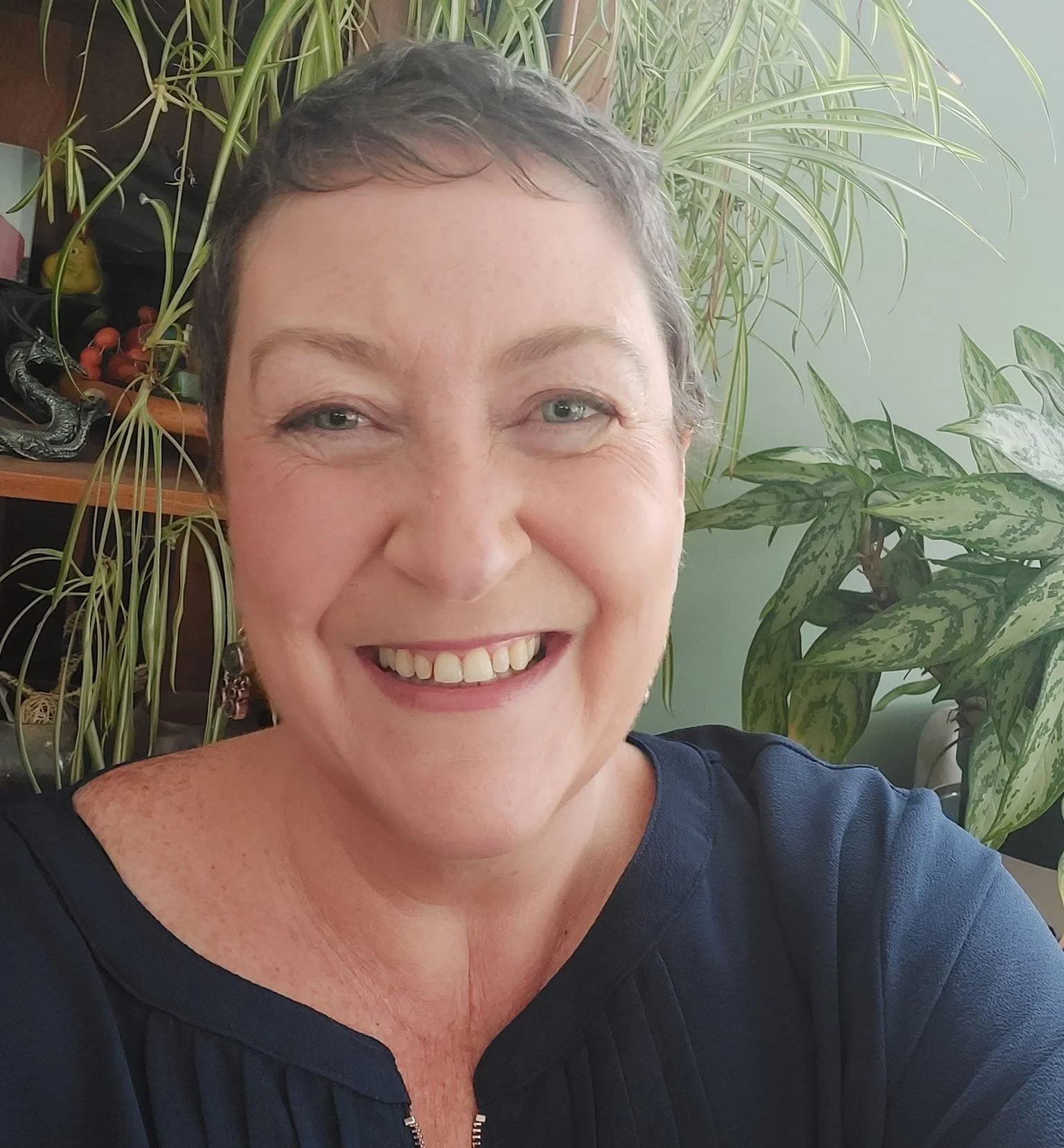
Stephanie Joy Phillips
World Childless Week Founder
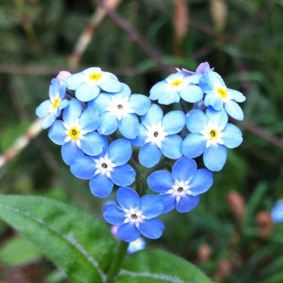
The forget me not has represented World Childless Week (WCW) since its inception. When I was looking for a logo for WCW it came up as one of the flowers representing September and as I’d already decided that WCW would run from Monday to Sunday around the 16th September it immediately felt right:
It represents true love and remembrance.
People wrongly assume that you cannot grieve for someone that never existed. Our children existed in our hearts, our heads and our dreams. So we will grieve them and we will remember them.
It is often viewed as a weed but it spreads its seeds and fights to reappear each year.
It represents the fight we face to be seen and the love we feel in our hearts for our unborn children. (You can read my initial blog at: Why have I used the forget-me-not as World Childless Week's image?)
WCW started in 2017 on a Facebook page and I grabbed an image from the internet. It was important that the image represented what I felt about our community.
After the first WCW finished I was blown away by the amount of submissions, feedback and support. I’d not expected the reactions and hadn’t even considered what would happen going forwards. I had two people ask if they could design a website for me and suddenly things became serious.
Whilst the website was under creation the logo was also discussed. I wanted to stick with the forget me not, and a simple design of five blue petals. An image was sourced and we now had an official logo to represent our community.

As the years passed and WCW grew, so did the meanings behind the forget me not:
We will not let society forget us
Forget me nots create a beautiful carpet of blue en masse but up close are thousands of individual flowers. We are all wonderful unique individuals, but as a community we are stronger and more visible.
We don’t just reappear each year, we grow stronger.
I decided it was time to update our logo to reflect more of what I felt it represented. During my research I came across Chinese Flower knots and liked the idea of our flower also representing the “knot” of the forget me “not” and no matter what circumstances brought us together we understood each other’s grief and were united in supporting each other. I wanted the design to incorporate the negative space so that it became an integral part of the overall design.
I explained my thoughts to Berenice Smith of Hello Lovely Design and she presented me with a selection of designs she found available to purchase online.
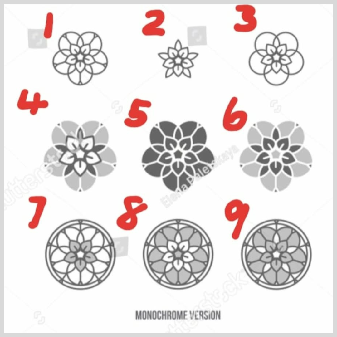
I asked a few friends for their thoughts and after eliminating the more basic designs and the ones that felt a little too ecclesiastical we decided together on design number 4.
I asked Berenice to stick with the colours of a traditional blue forget me not and after she coloured it in it resulted in the beautiful logo we have today.
Over the last ten years our forget me not has grown and blossomed reflecting the growth and strength I have witnessed within our community.
Our forget me not is ours and ours alone, it represents each of us as individuals and also as a collective. Our forget me not is there to say we refuse to let society forget us and in turn we will not forget our unborn children.